Magnicity
DESIGN A SYSTEM FOR 7 ENTITIES OF THE GROUP
Leverage the rebranding of M56 Group to Magnicity, to redesign the websites of the 7 rooftops around the world.
Use the needs of the 360 Chicago website as the basis for all the needs of the group.
Context
360Chicago is one of the 7 rooftops of Magnicity Group. I worked as UX Designer on a proposal aiming to rethink and redesign the 360Chicago website experience. The deal was closed after a convincing pitch and we have designed a beautiful design system for the international group.
Design challenge
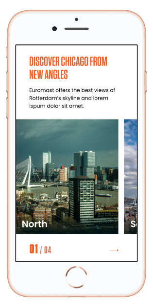
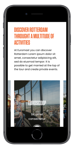
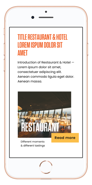
Over a period of 4 months, we have built a modular system that fits all the activities of Magnicity’s brands : restaurants, bars, events, sports...
The objective was to homogenise and modernize the e-commerce sites of their rooftops.
Design Principles
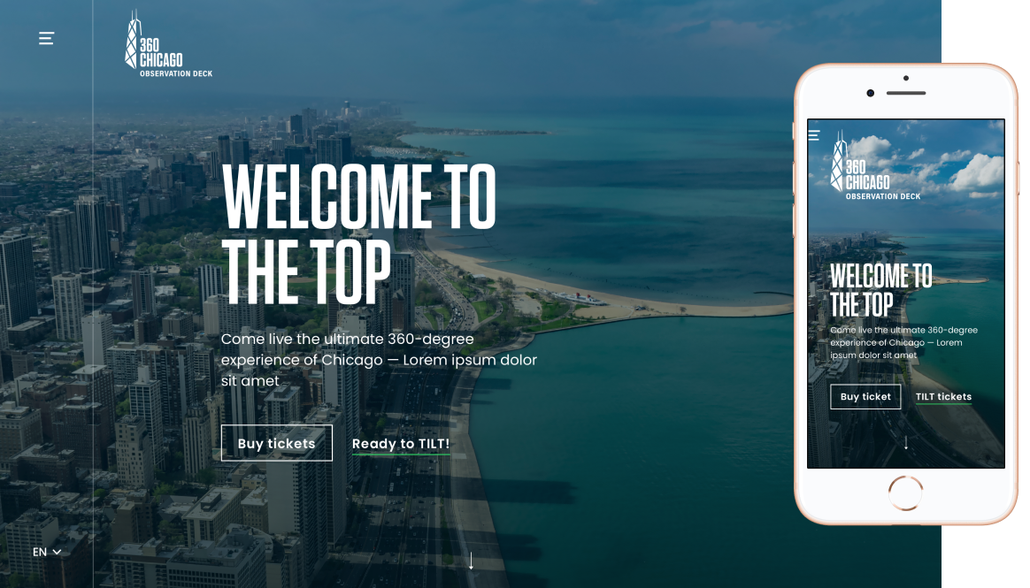
The aim is not to sell the tower but the experience customers are going to live at the top of it.
Taste the experience
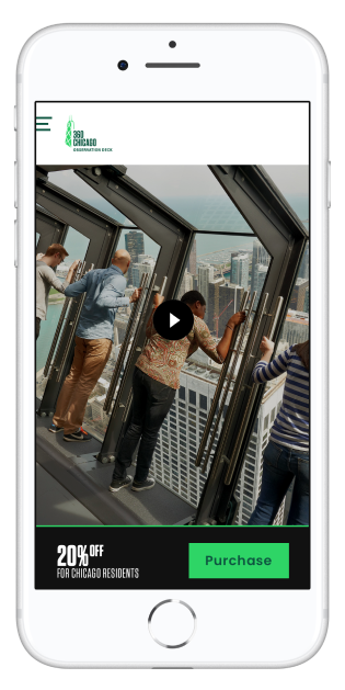
Provide the IRL experience on the website, give a small glimpse of the skyline and an impression of altitude.
Create desire
Show the best view of the city, change as a function of time and weather.
Make it easy
Provide practical information to prepare the visit, about the tower and about surroundings.
360 Chicago's customers
Most customers are women. 50% of them are under 34 years old. They travel either alone or as a couple or a family and buy their tickets when they are in Chicago. So we worked mobile first.
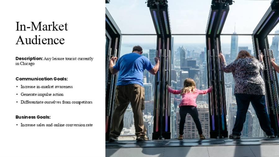
In market tourists
Any leisure tourist currently in Chicago.
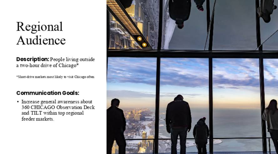
Regionals
People living within a two-hour drive from Chicago.
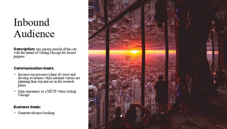
Inbound audience
Any person outside the city with the intention to visit Chicago for leisure purposes.
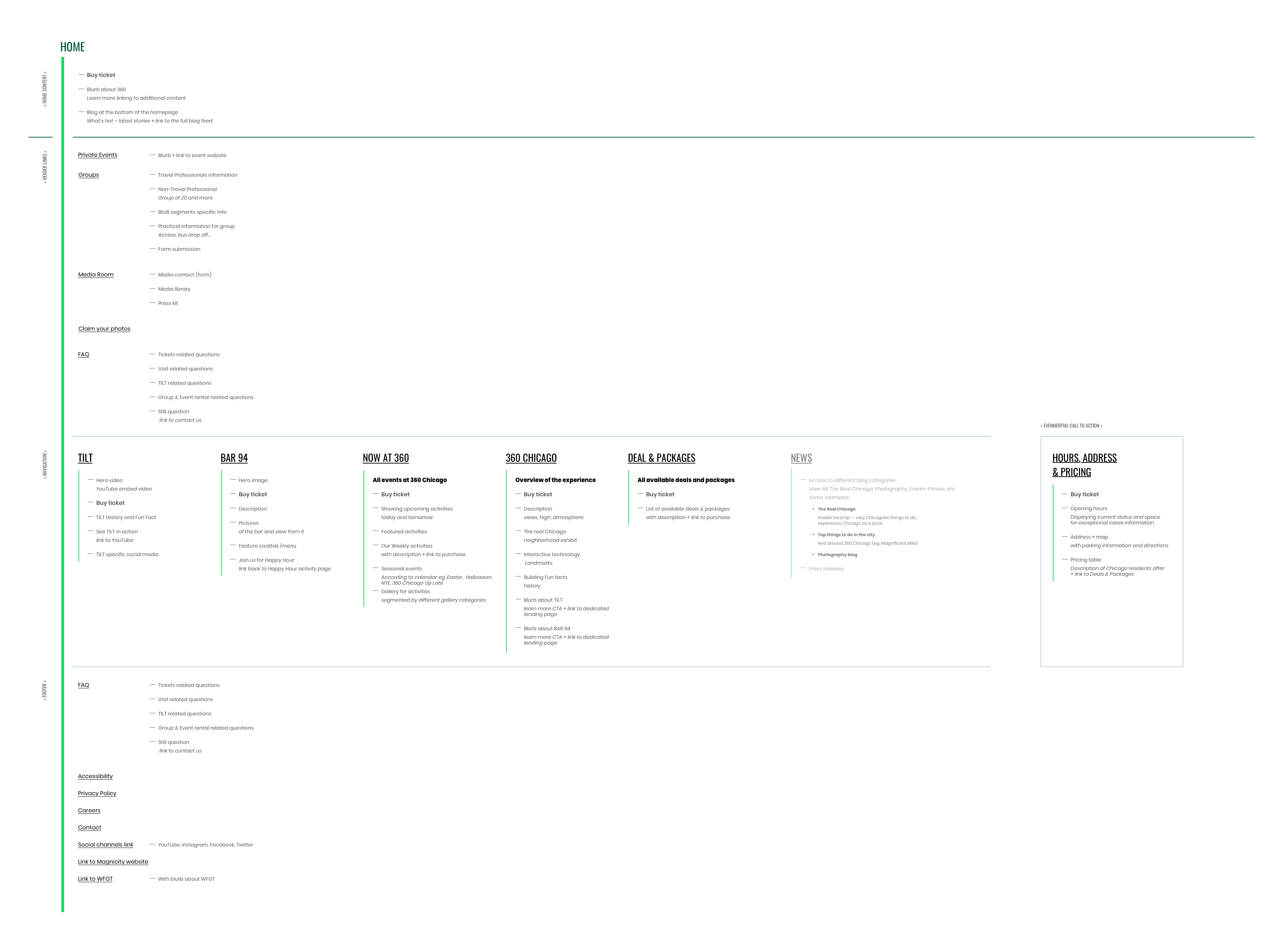
Information structure
After an audit of Magnicity websites, I came out with a structure divided in 3 parts, designed to work for each rooftops.
Header links
For private users and people who have already been there.
Main navigation
To show the offer and help new users in their choices.
Footer
Practical information (Opening hours, address, FAQ, accessibility, contacts...)
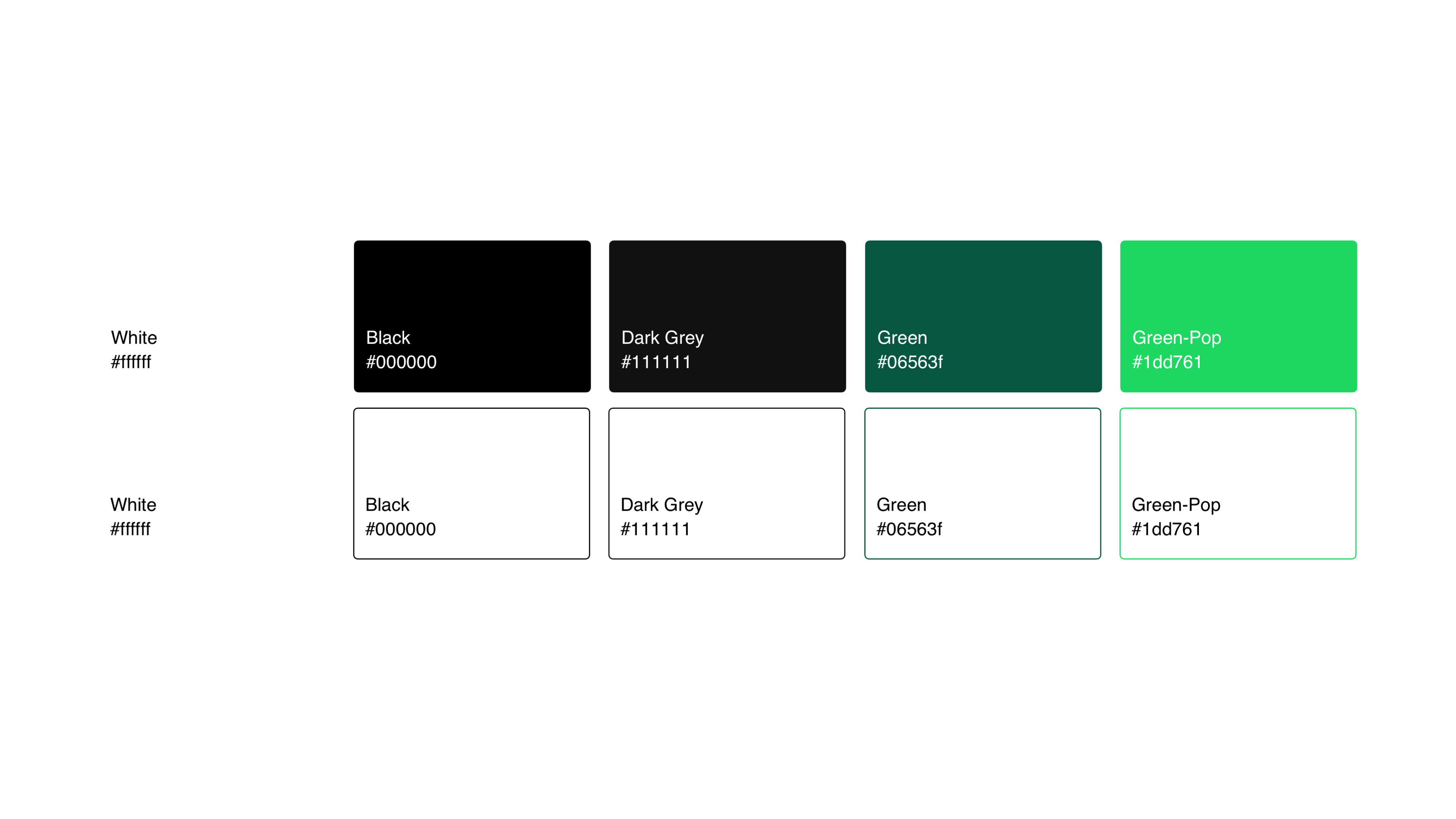
Digitalize the brand
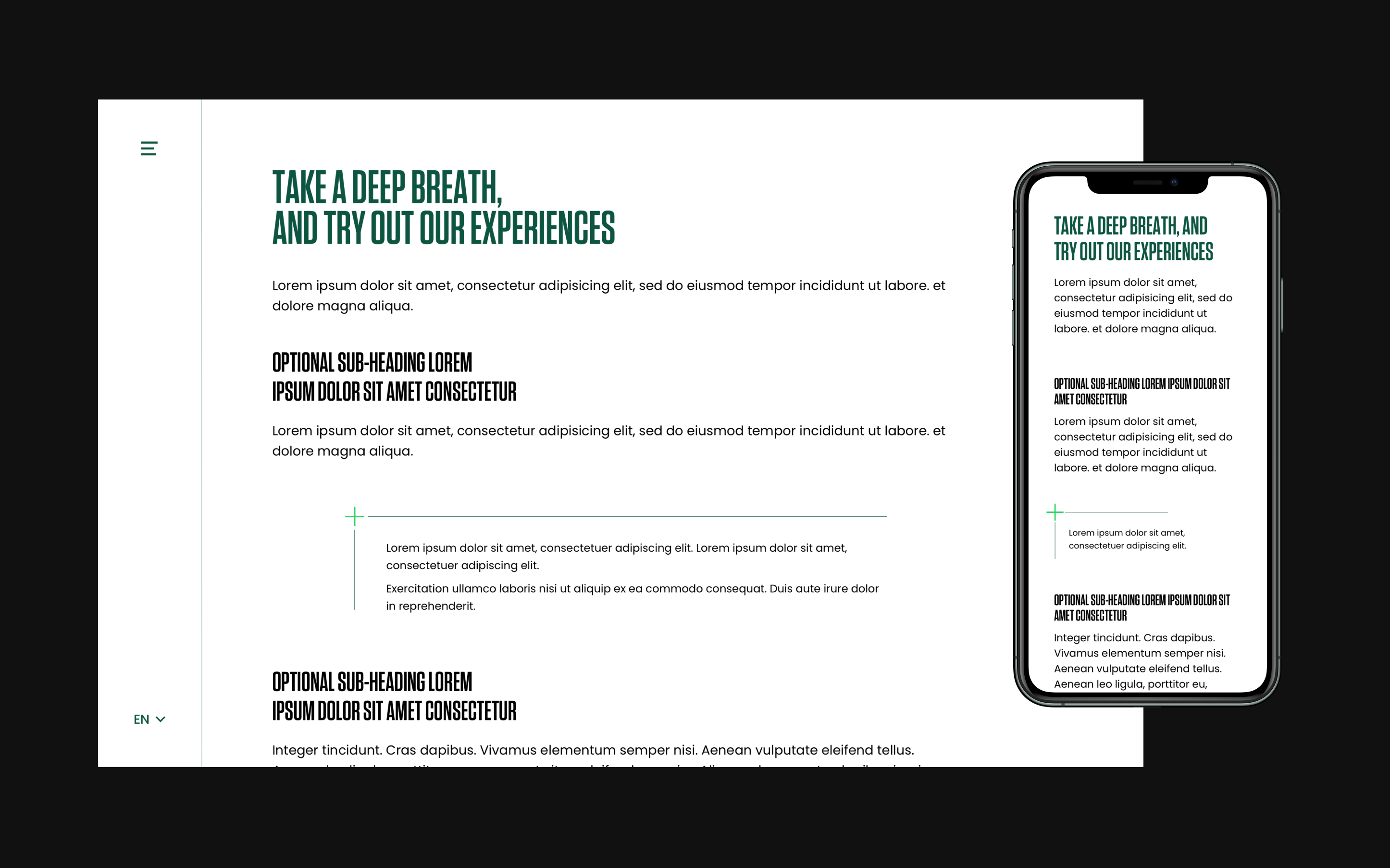
I worked with an Art Director. She designed a typography that enhances the brand, the highness of the offer. She also worked on new colors that fit all the 360 Chicago image.
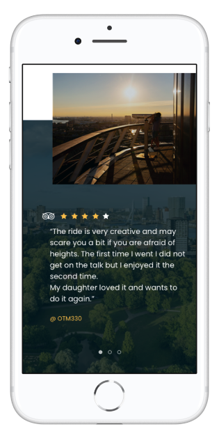
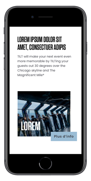
We designed an immersive website that highlights the altitude of the rooftop, the panoramic view and all the activities customers can experience at the top of the building.
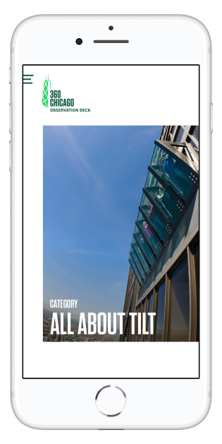
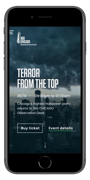
Depending to the moment of the day, the season or the age of the customer, 360Chicago is offering a wide range of activities : happy hours at the bar, TILT attraction, yoga lessons, Halloween, etc.
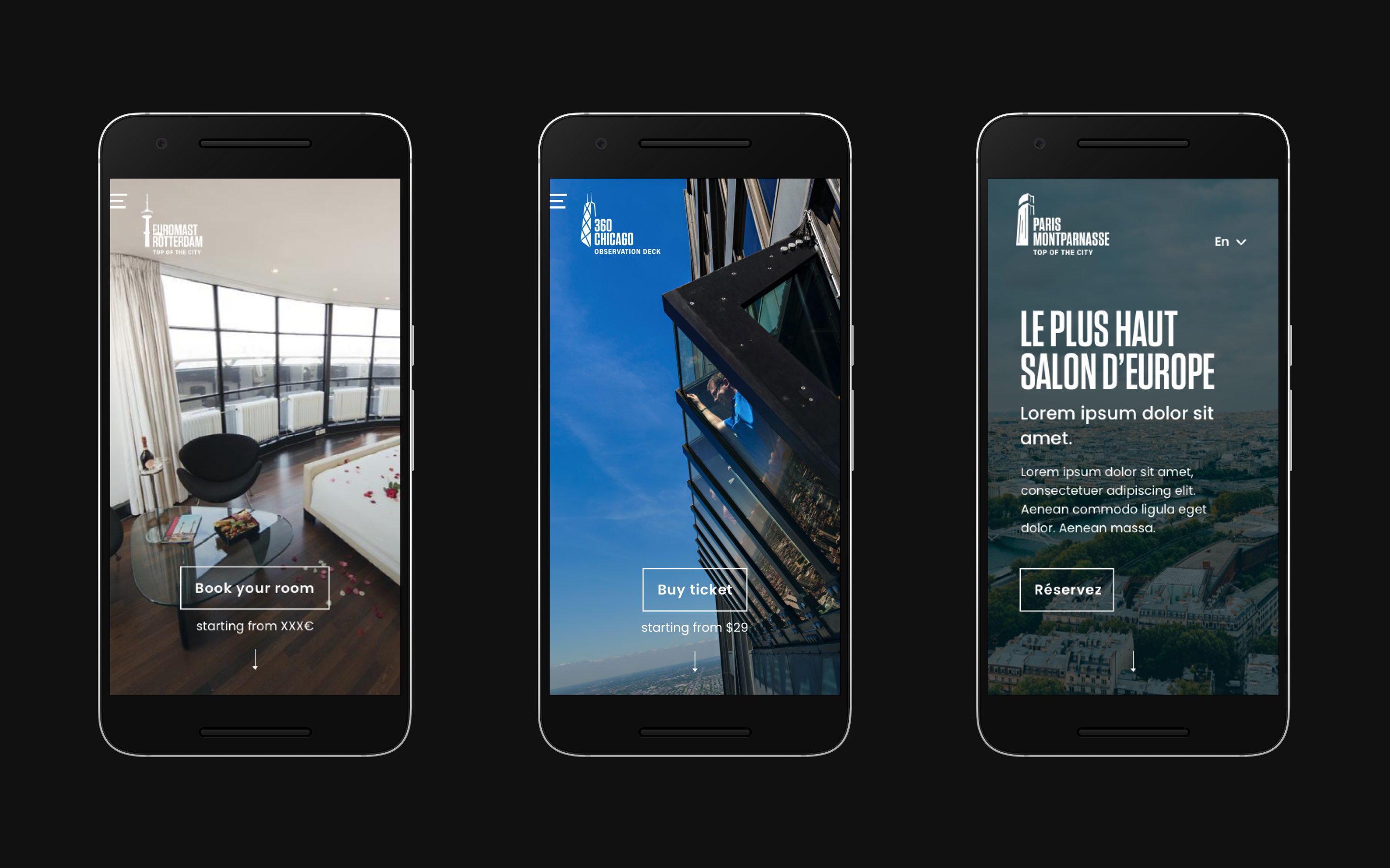
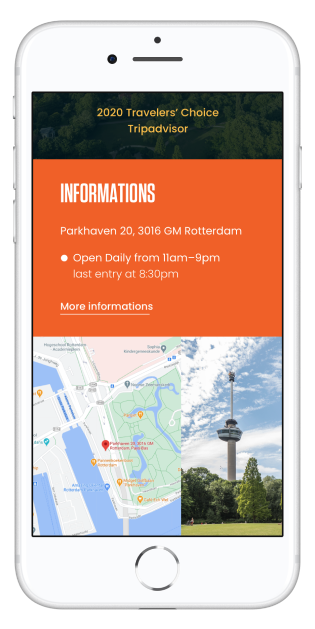
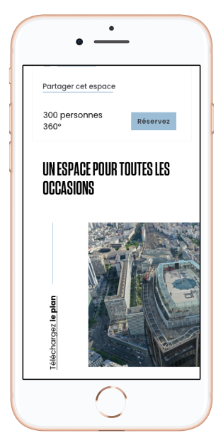
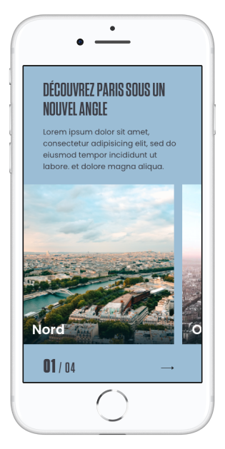
After our work on Chicago's rooftop, we rolled out the system on the Parisian and the Rotterdam ones.
Thanks to our modular approach, we delivered websites in no time and uniformized the online experience accross facilities.


Role
We worked with a team based in Chicago. All the work was in English and the website has been designed remotely from Paris.
I was responsible of the user experience, the customer understanding and the structure of the information. We created a website with a smooth and clear user experience.
The biggest issue we faced was the COVID-19 period and its uncertainty for tourisitic activities.
Thanks for reading.
Other projects
Since 2018 I had the opportunity to work on design systems, customer experience, back-office, b2b projects, b2c projects, luxury and consumer goods. Discover my other works in the list below.